ArisGlobal’s premier Life Sciences leadership event.
Breakthrough 2026 unites top life‑science leaders to showcase tech driving drug development and safety adherence. Hosted by ArisGlobal, the event offers expert sessions, demos, and panels on AI‑driven R&D, and more. Attendees gain practical insights, tools, partnerships, and actionable strategies to speed innovation and ensure compliance across the product lifecycle.
Logo Design
The Breakthrough logo was developed within strict constraints: it needed to follow ArisGlobal’s style guide, work alongside the company logo, and scale across a wide range of materials. I chose a block-text design with a light font treatment so the logo could be divided, stacked, resized, and updated year after year without losing its integrity. This simple, versatile design integrates cleanly across digital and print formats and reflects a focused commitment to innovation in the life sciences.
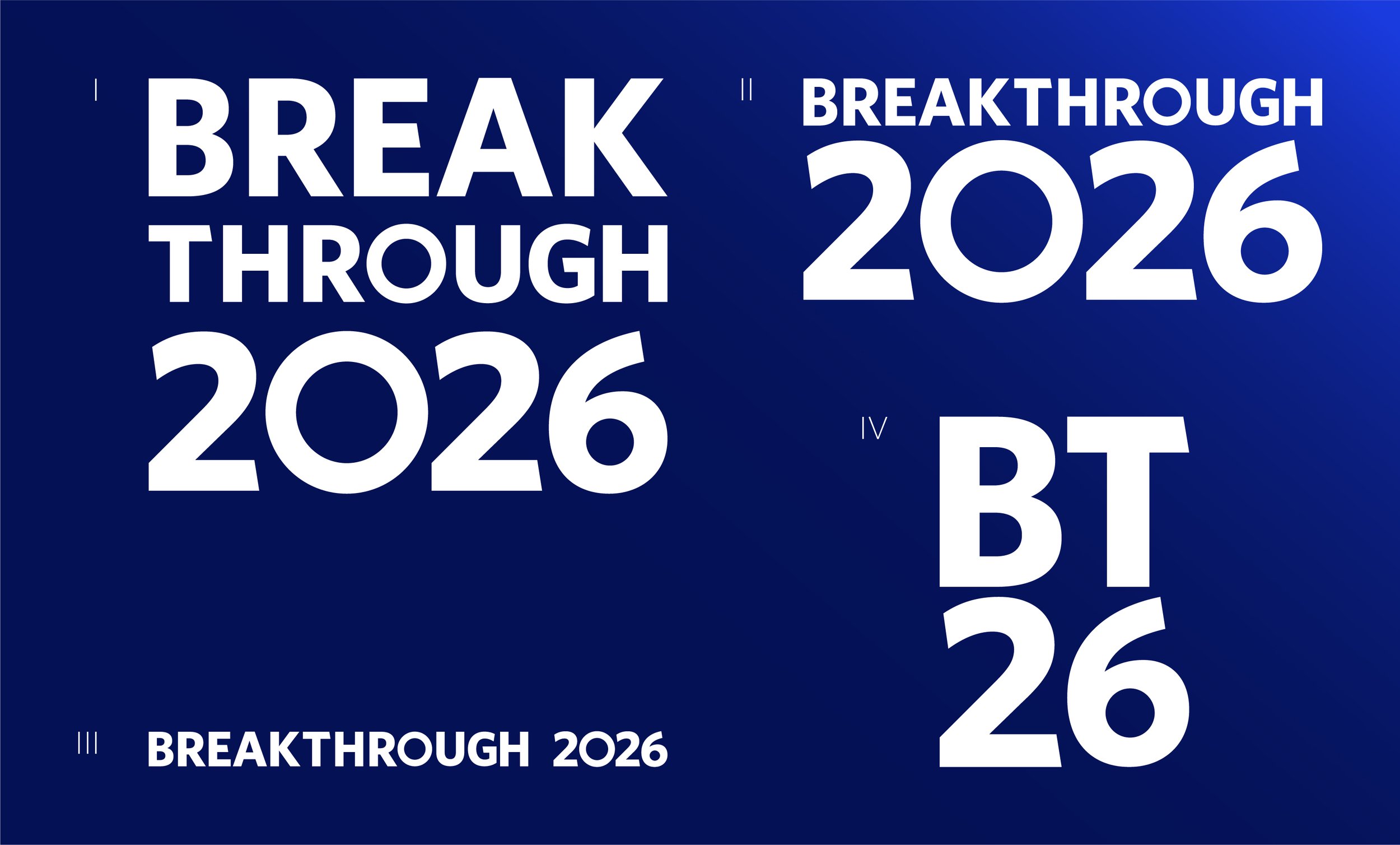
l. 3-Stacked Logo ll. 2-Stacked Logo lll. Single Line Logo lV. Reduced Logo
Background Design
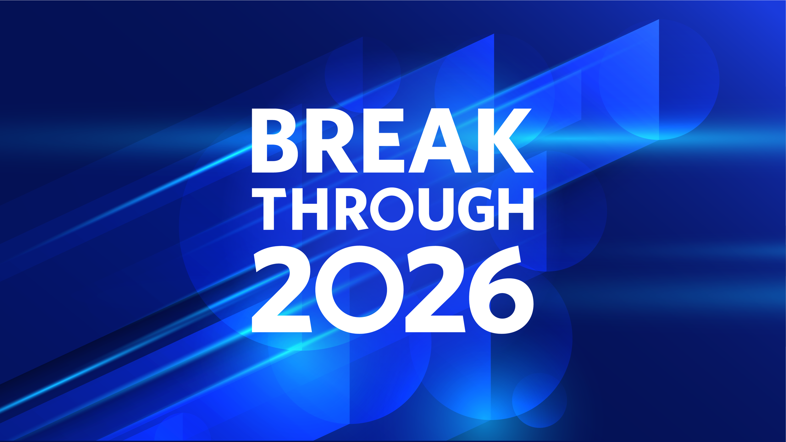
The original design request called for using the circle motif from previous years and create the impression that the logo was breaking through a wall or pane of glass. This communicated the idea of “breakthrough” very literally, but was too on-the-nose and could potentially associate ArisGlobal’s identity with breaking, sharp edges, and angular debris. Instead, I chose to abstract the concept and explore the larger themes behind Breakthrough.
The event centered on gaining velocity in innovation, moving further and faster with AI, and redefining what’s possible in the Life Sciences. I translated that idea into a visual system built around circular forms and forward momentum. The circles reference scientific elements such as cells, microscope lenses, and Petri dishes, while also connecting to the “O” and “0” in the Breakthrough logo. Angular, glass-like forms introduce a sense of speed and movement while subtly representing the barriers being broken through. I also shifted from ArisGlobal’s buttoned-down navy toward its more vibrant blue, giving the design more energy and visual impact.
The result was a dynamic, modern visual language that captured the spirit of Breakthrough while remaining flexible across the event’s digital, social, presentation, and environmental graphics.
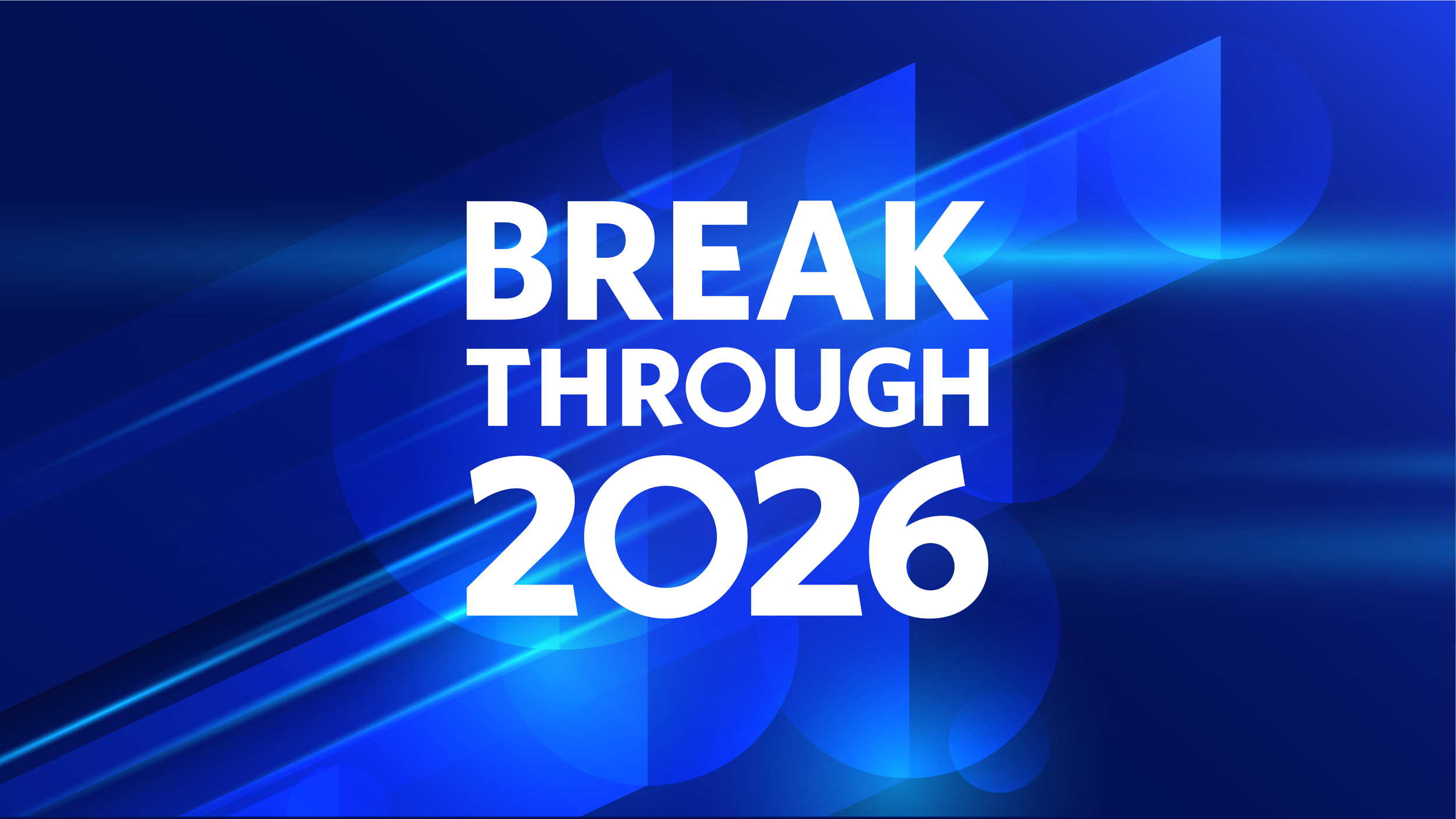
Main Breakthrough design/presentation title slide
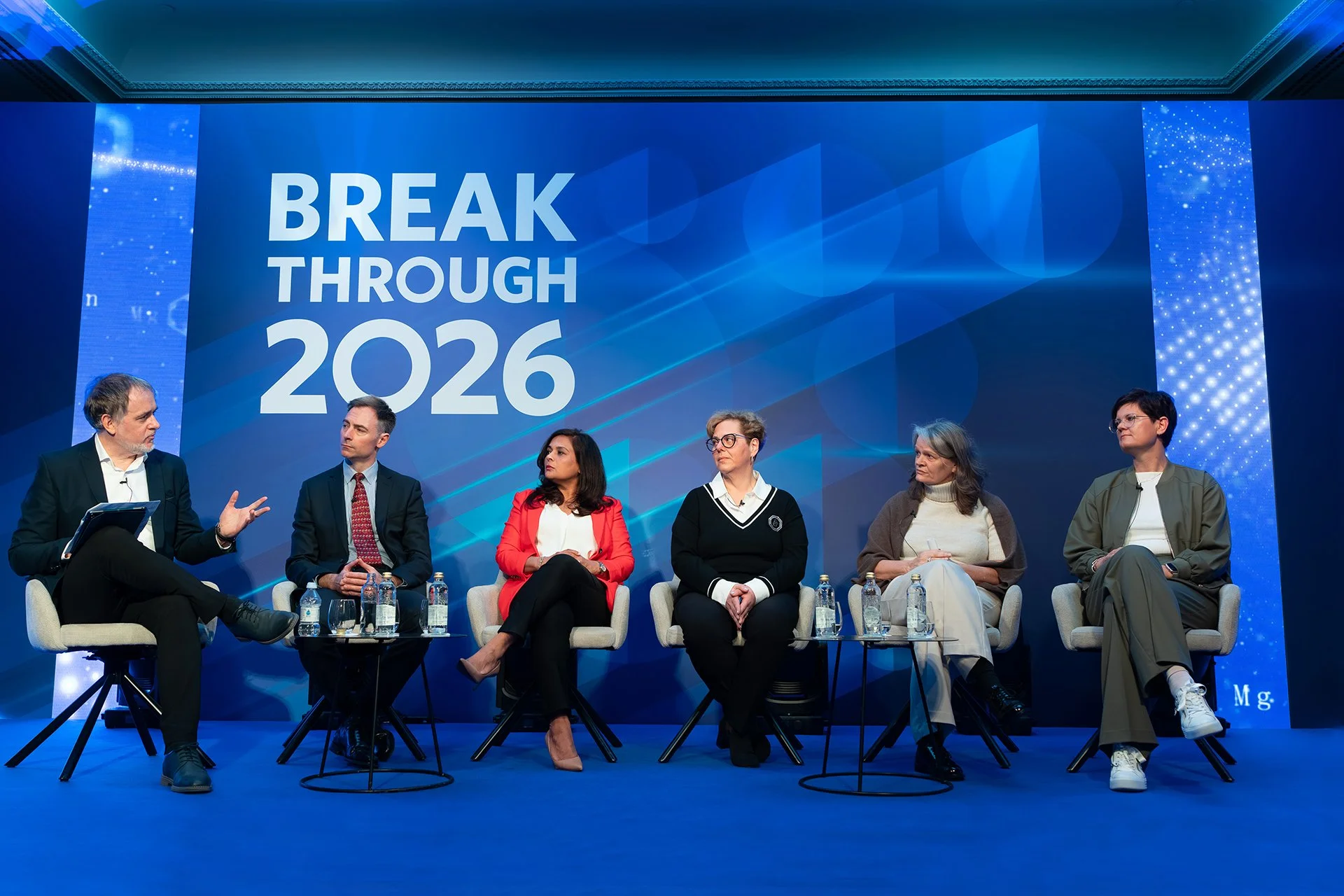
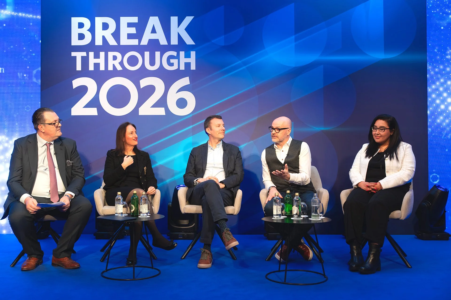
Main Stage
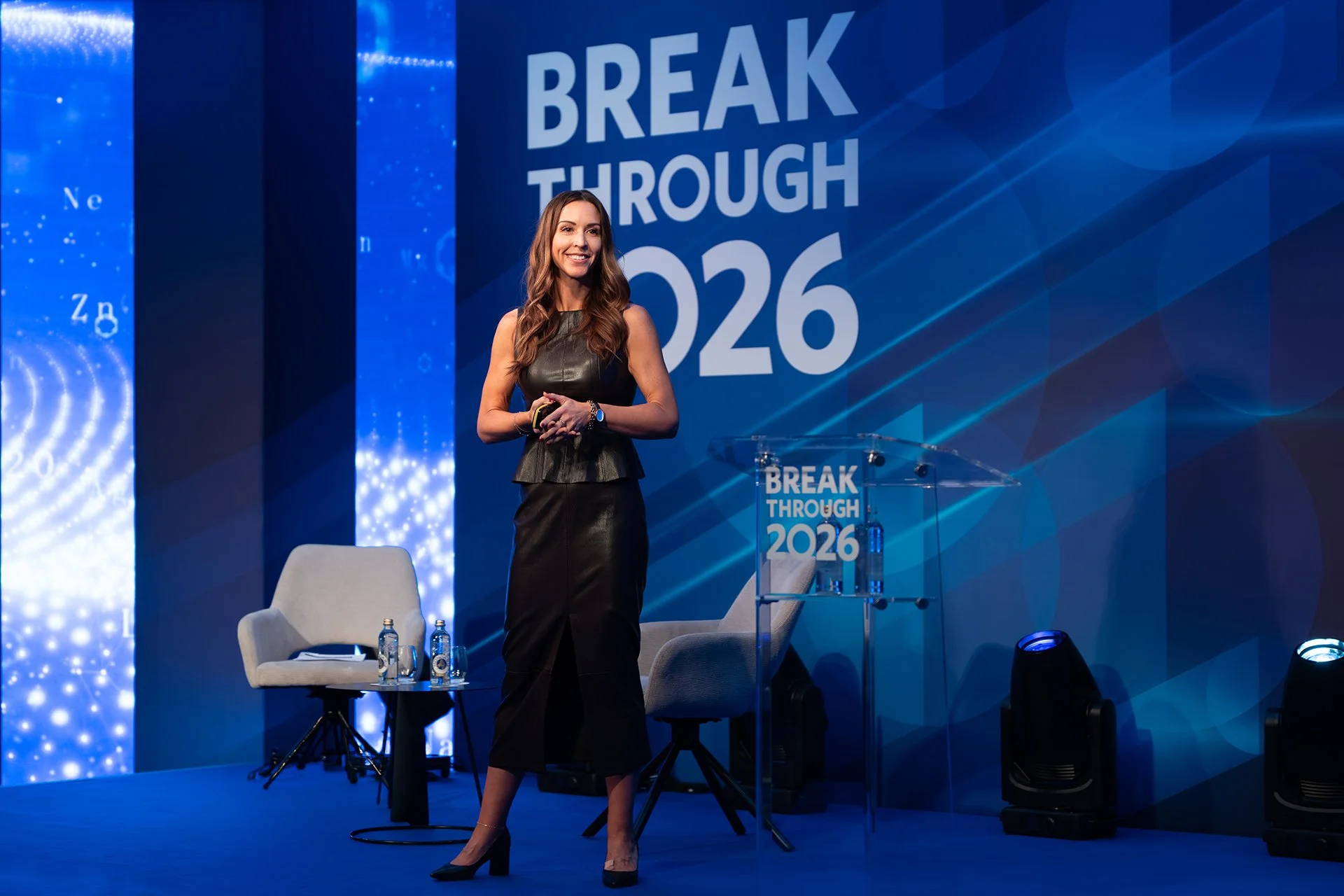
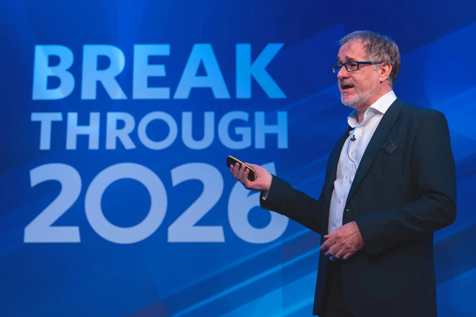
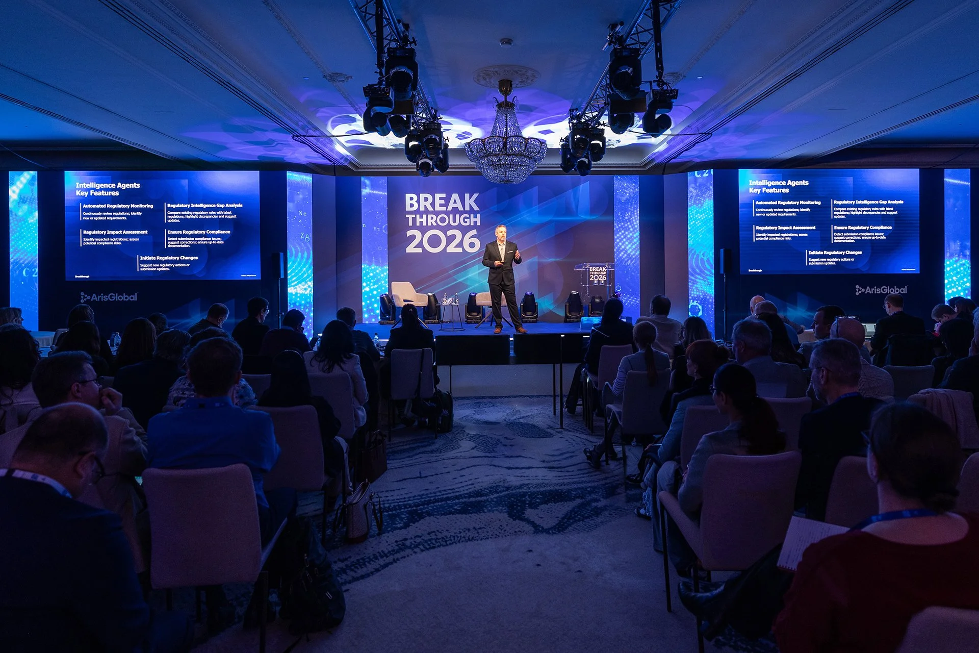
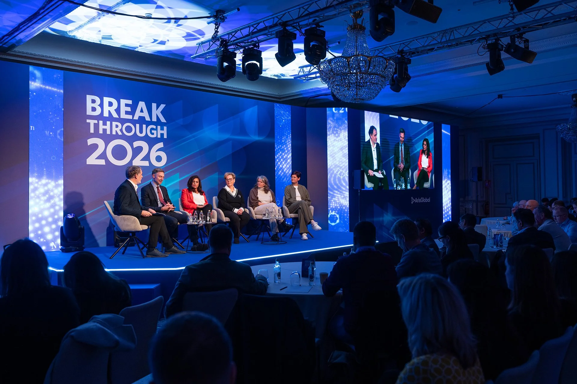
This was the largest stage I’ve designed for, featuring two large presentation screens, six narrow led displays for sponsor logos and animation, and a dedicated area for panel discussions and fireside chats. To translate the Breakthrough design across such a large space, I intentionally kept the surrounding graphics minimal, rather than compete with the content on screen. The visual elements were composed to frame the stage and naturally drive attention toward the center, creating a cohesive experience that reinforced the original design concept at a much larger scale.

Original working design at a glance
Presentation
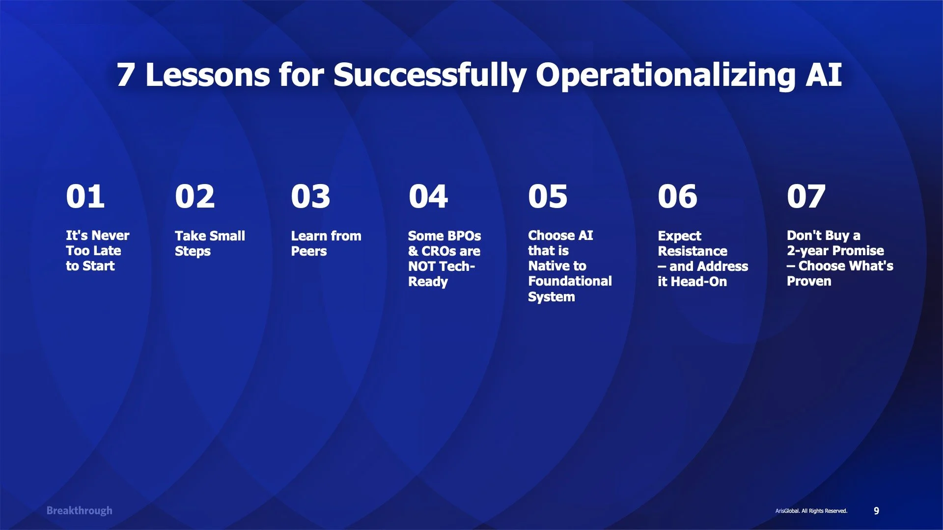
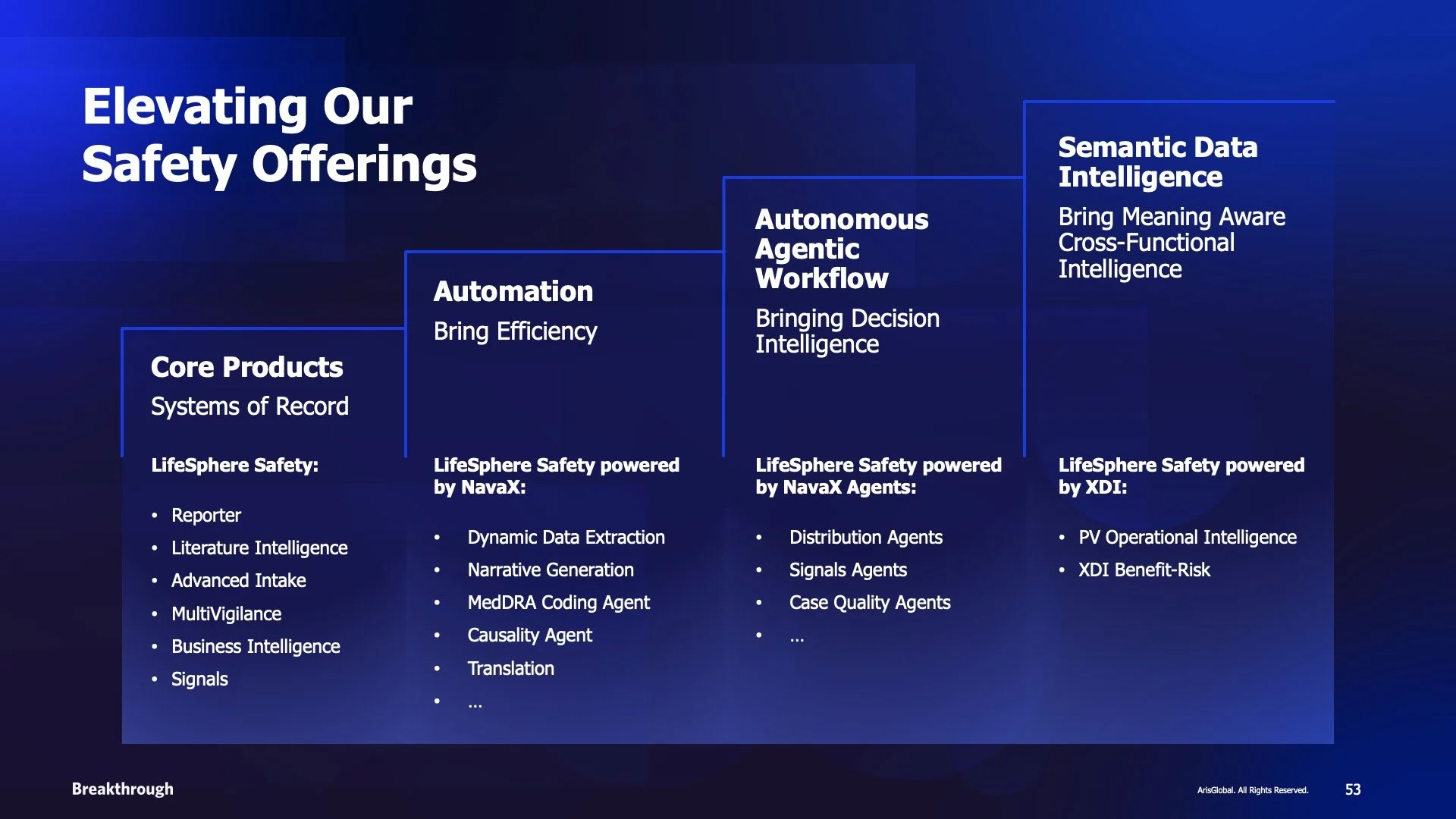
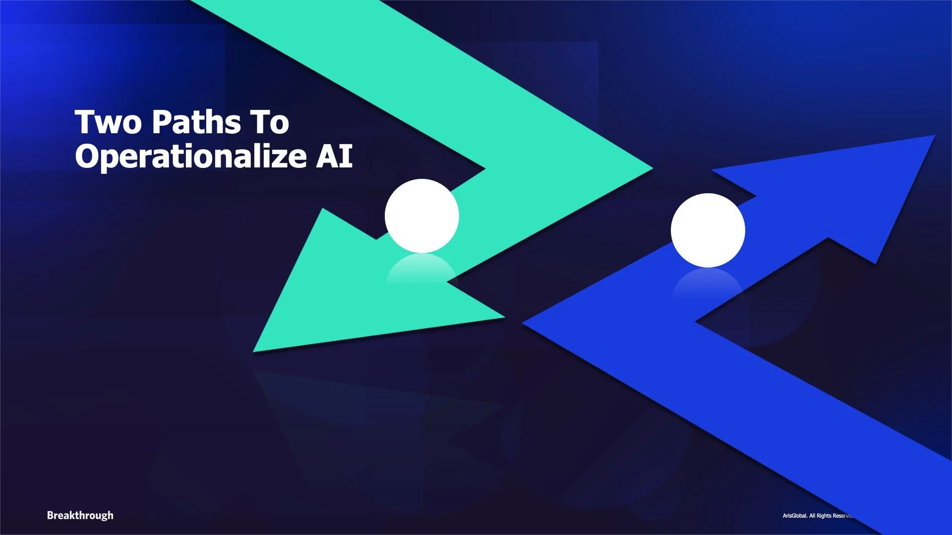
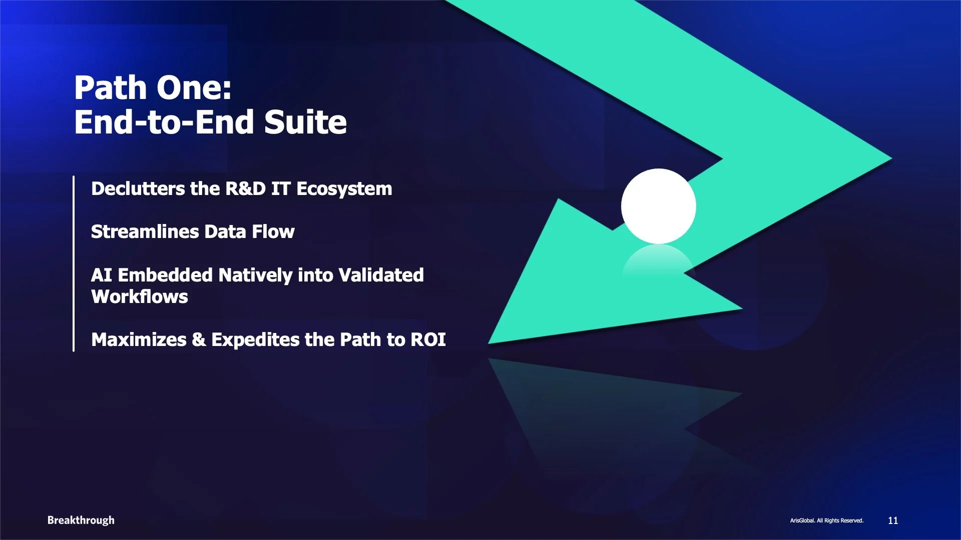
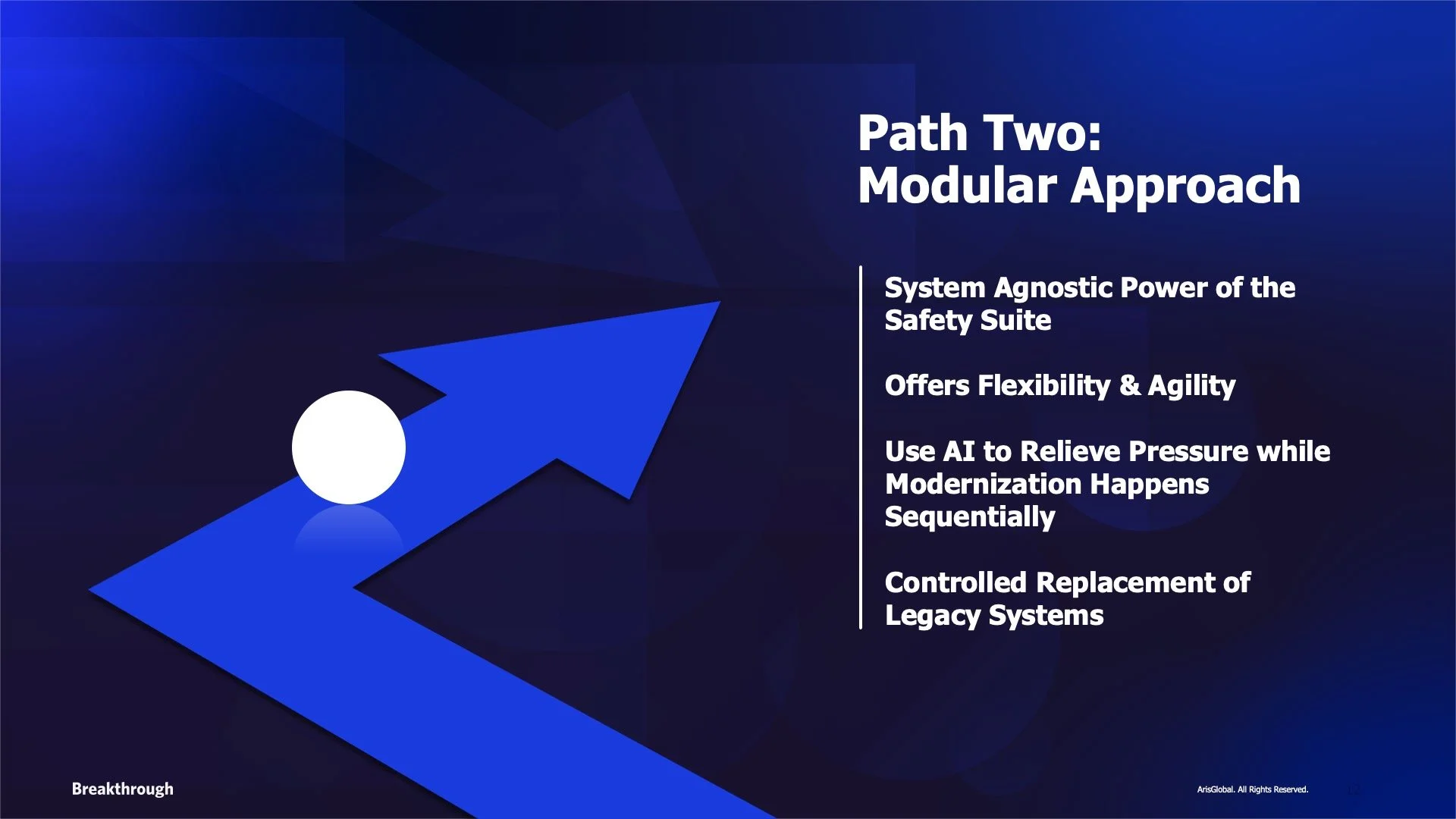
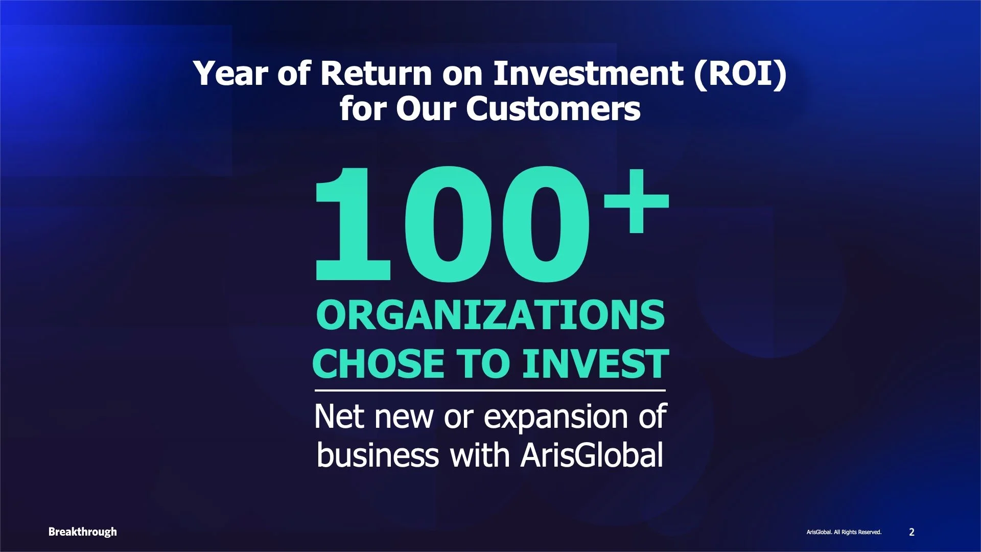
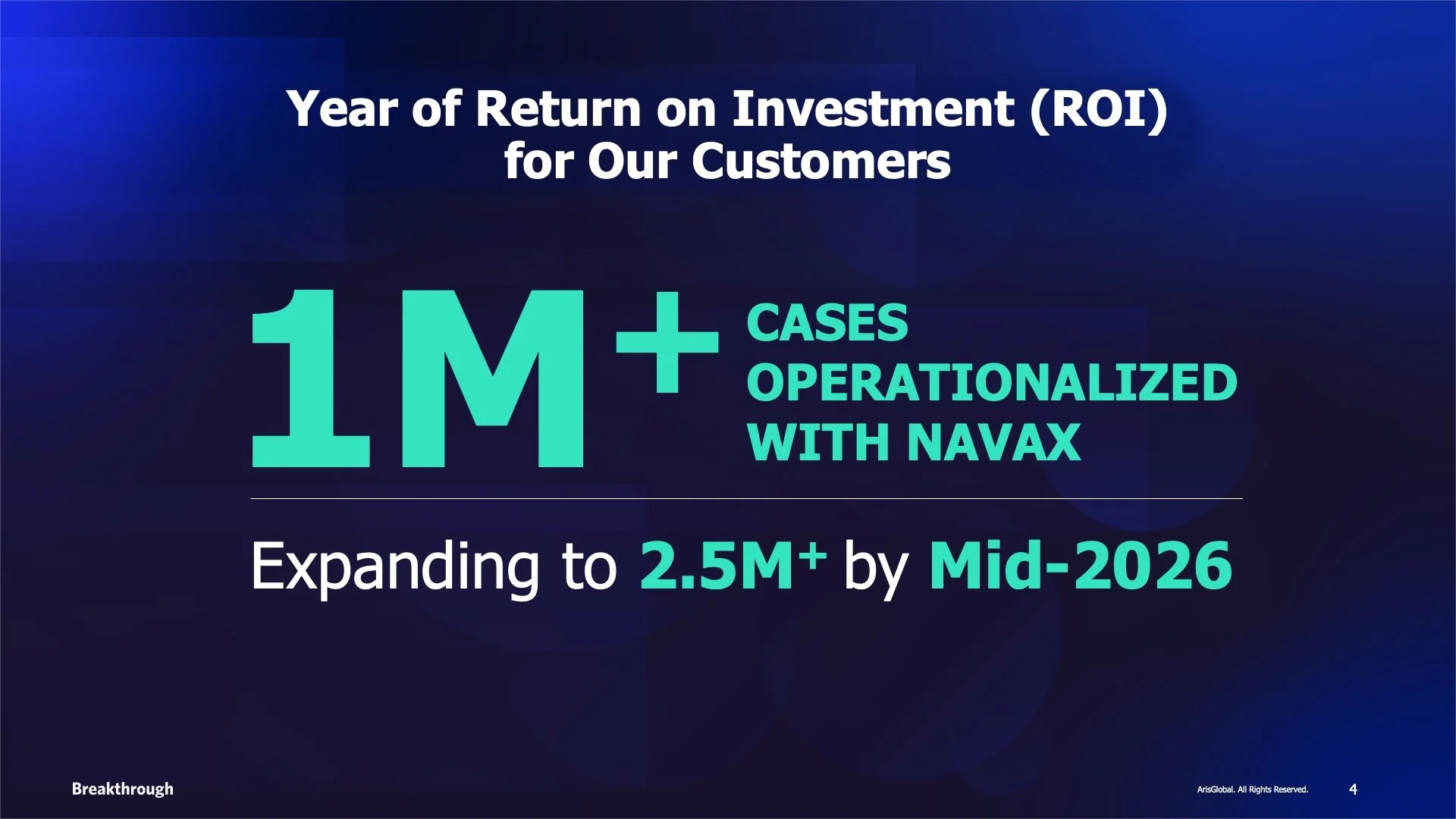
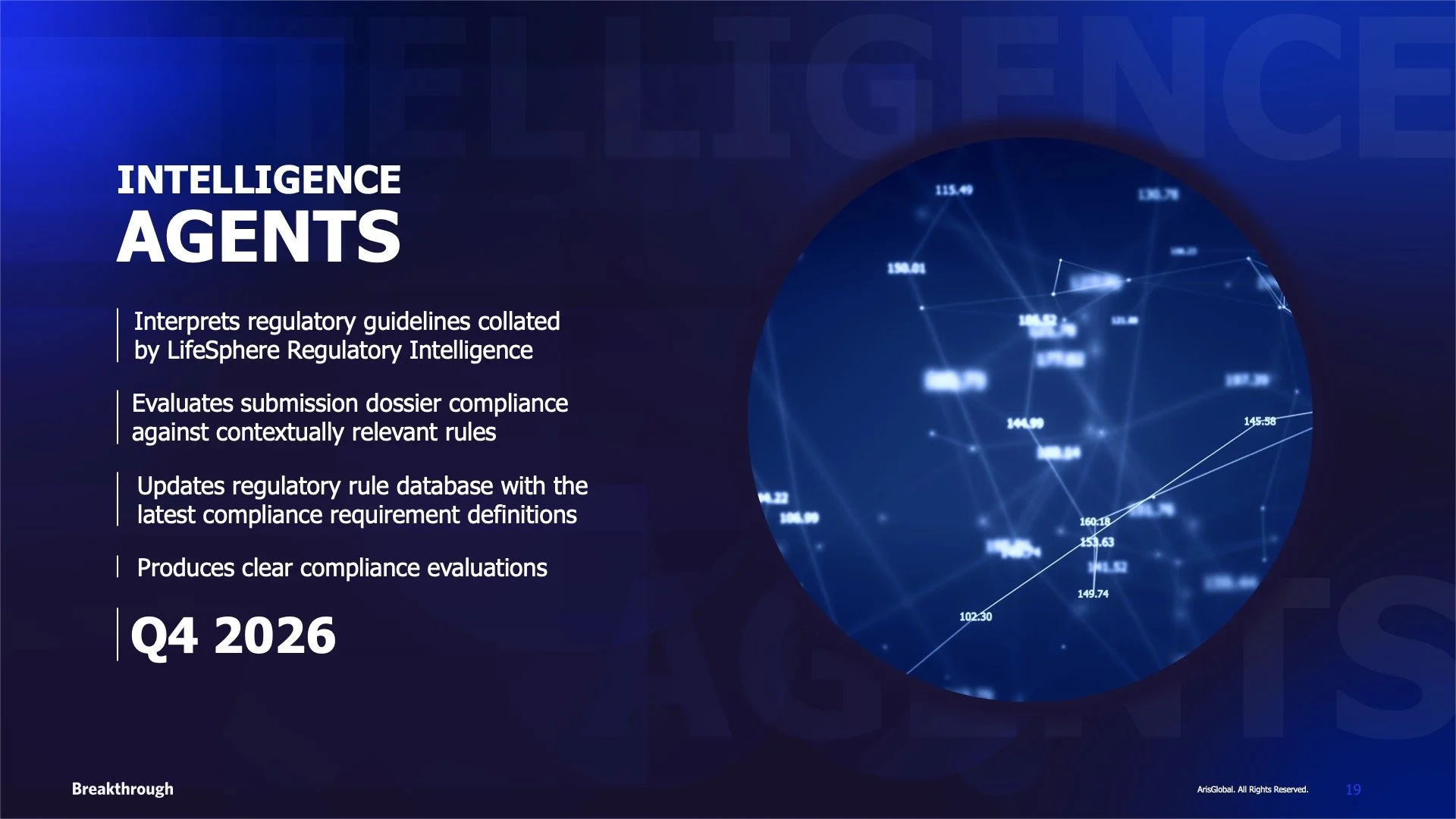
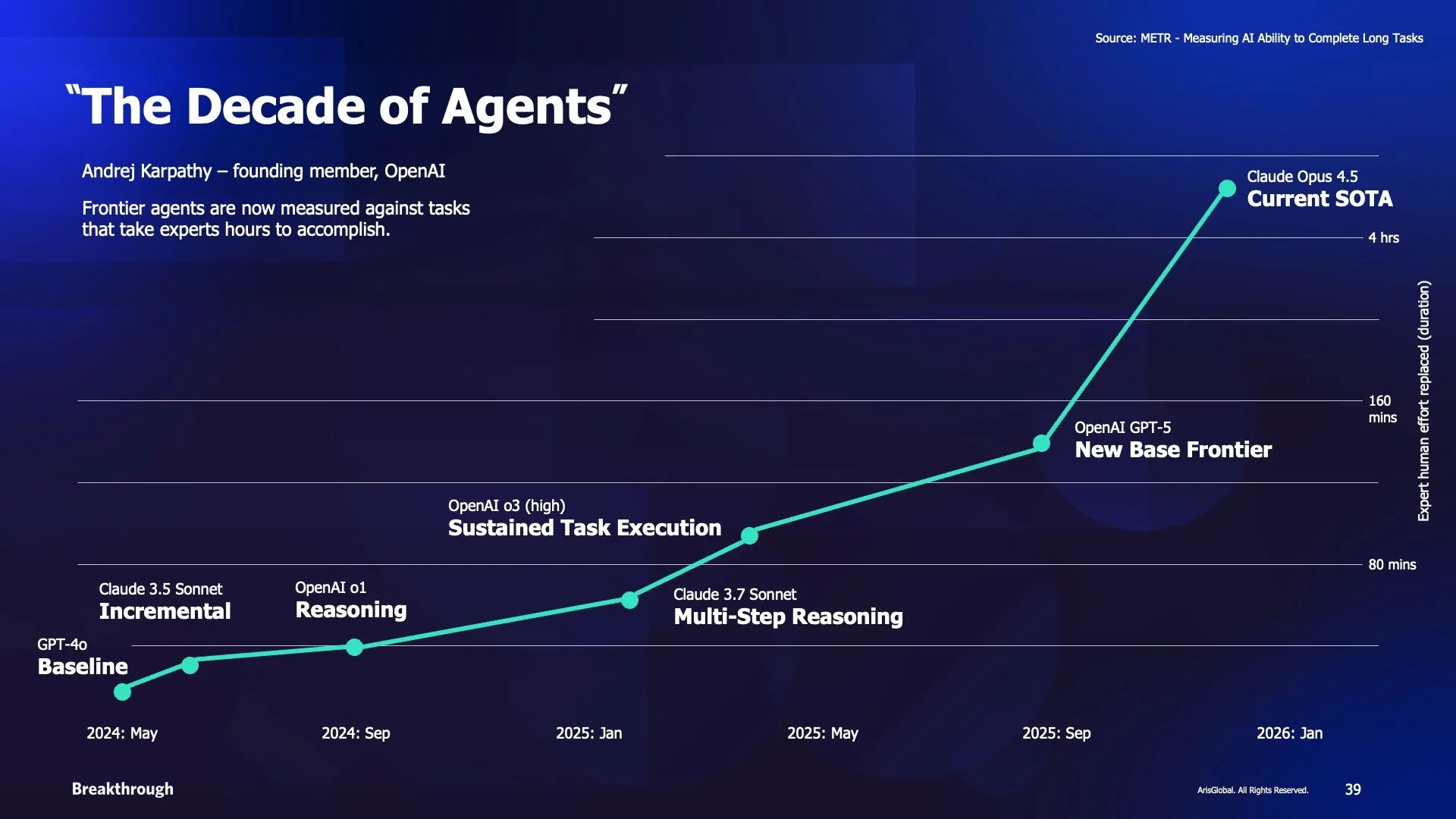
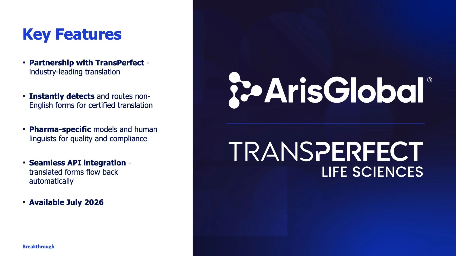
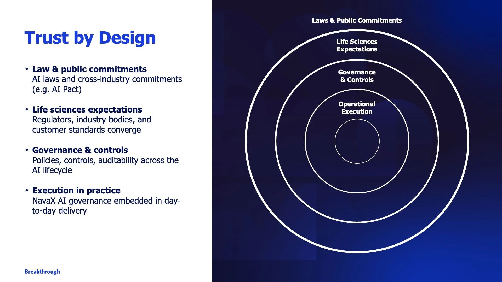
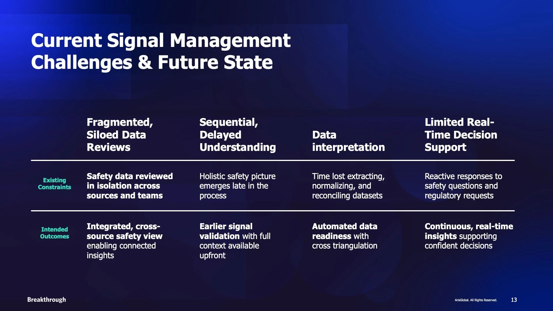
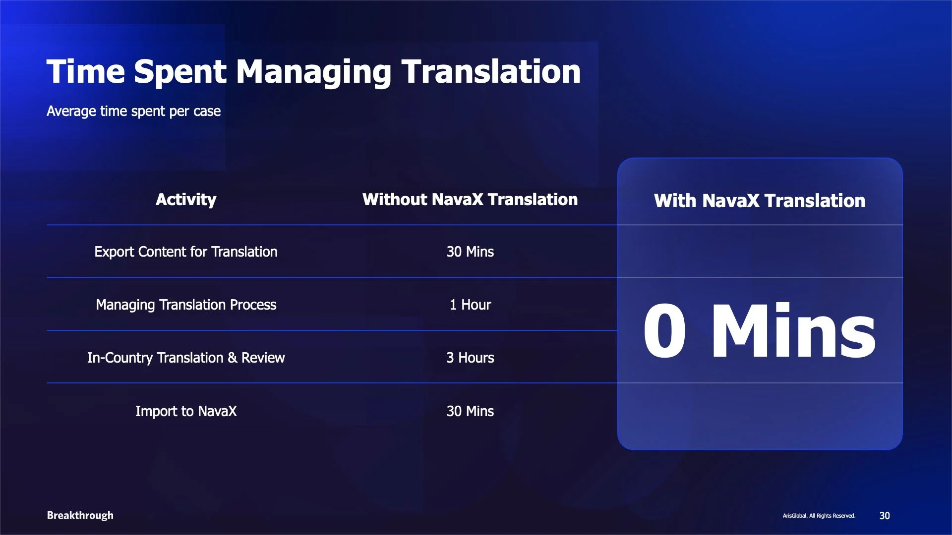
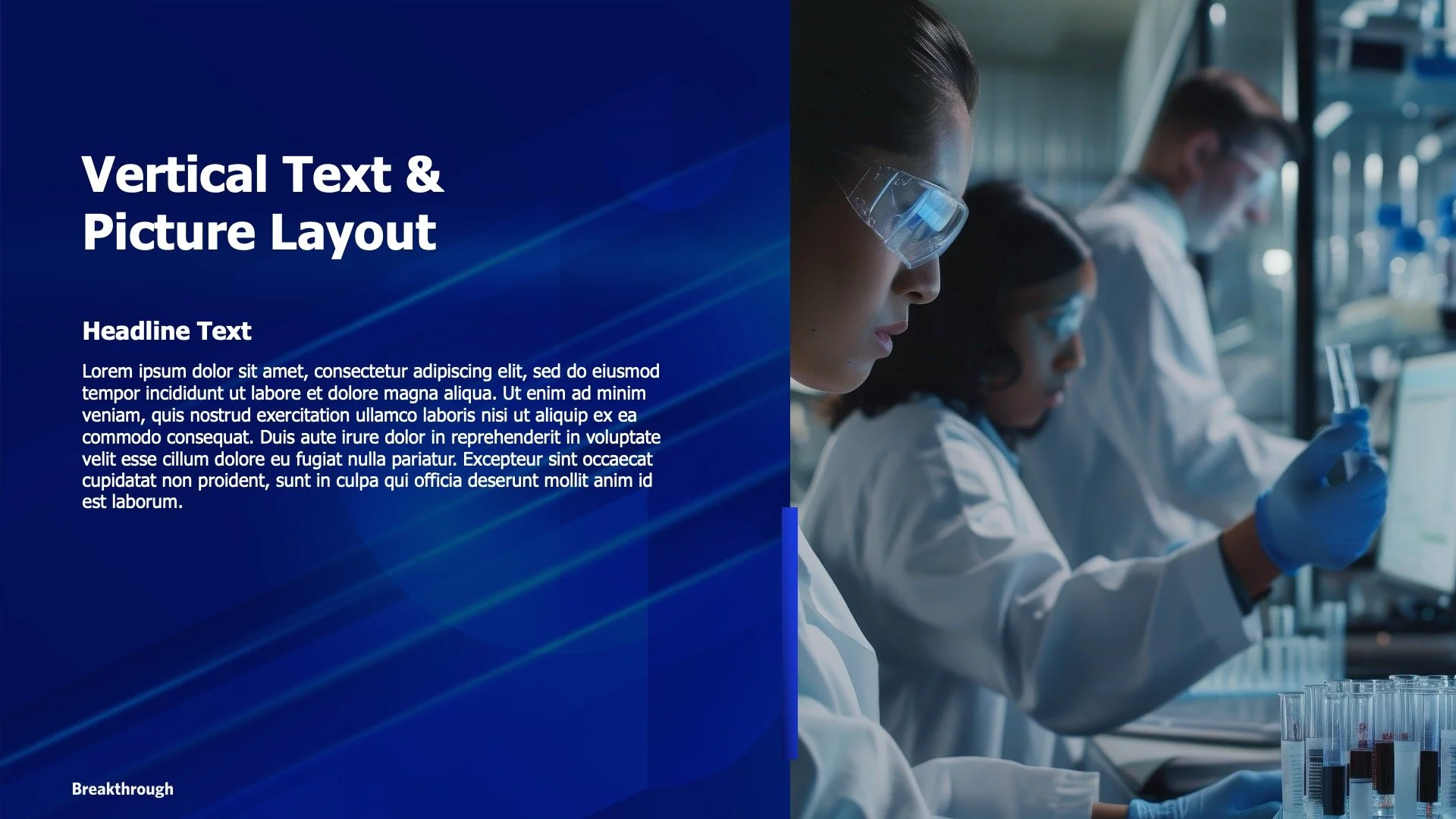
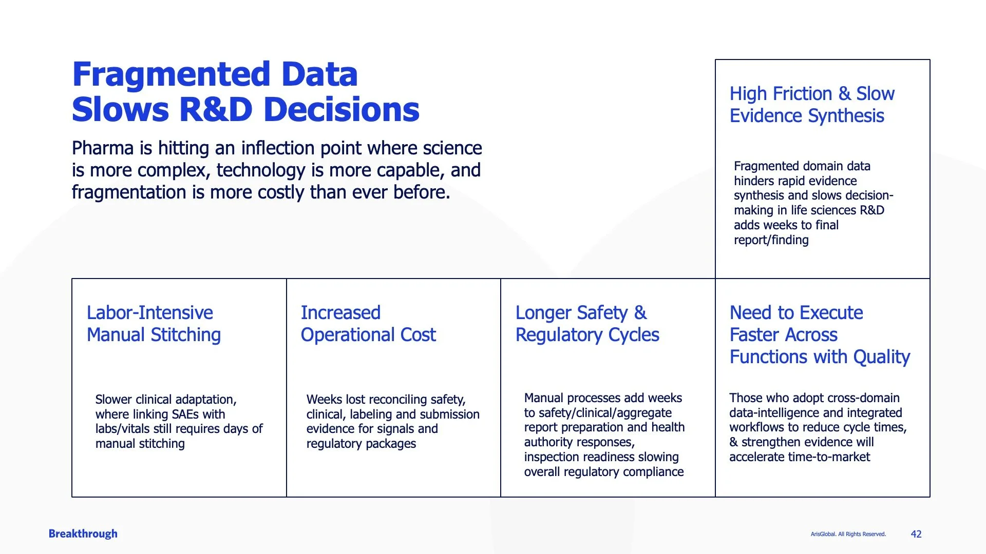
Because the event’s background graphic and logo were both visually strong, I carried that same visual language into the presentation design. I used the primary graphic to balance denser content, while creating a secondary, more subtle background treatment for charts, graphs, and statistics.
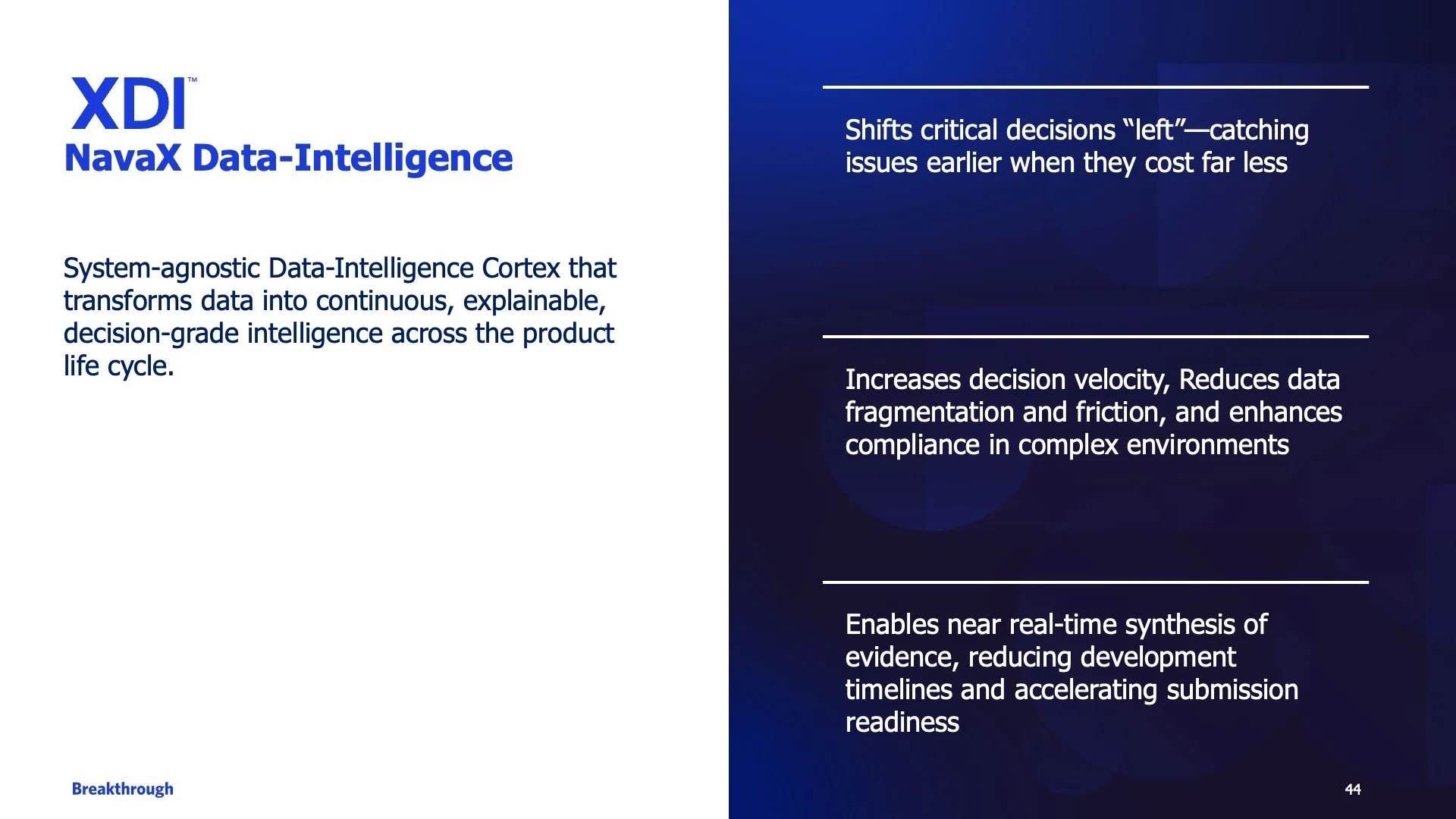
To keep the presentation from feeling visually overwhelming, I also introduced intentional white space and occasional all-white slides. These moments gave the audience’s eyes a place to rest while creating contrast against the heavy navy and vibrant blue of the ArisGlobal color palette.
Social Media & Other Collateral
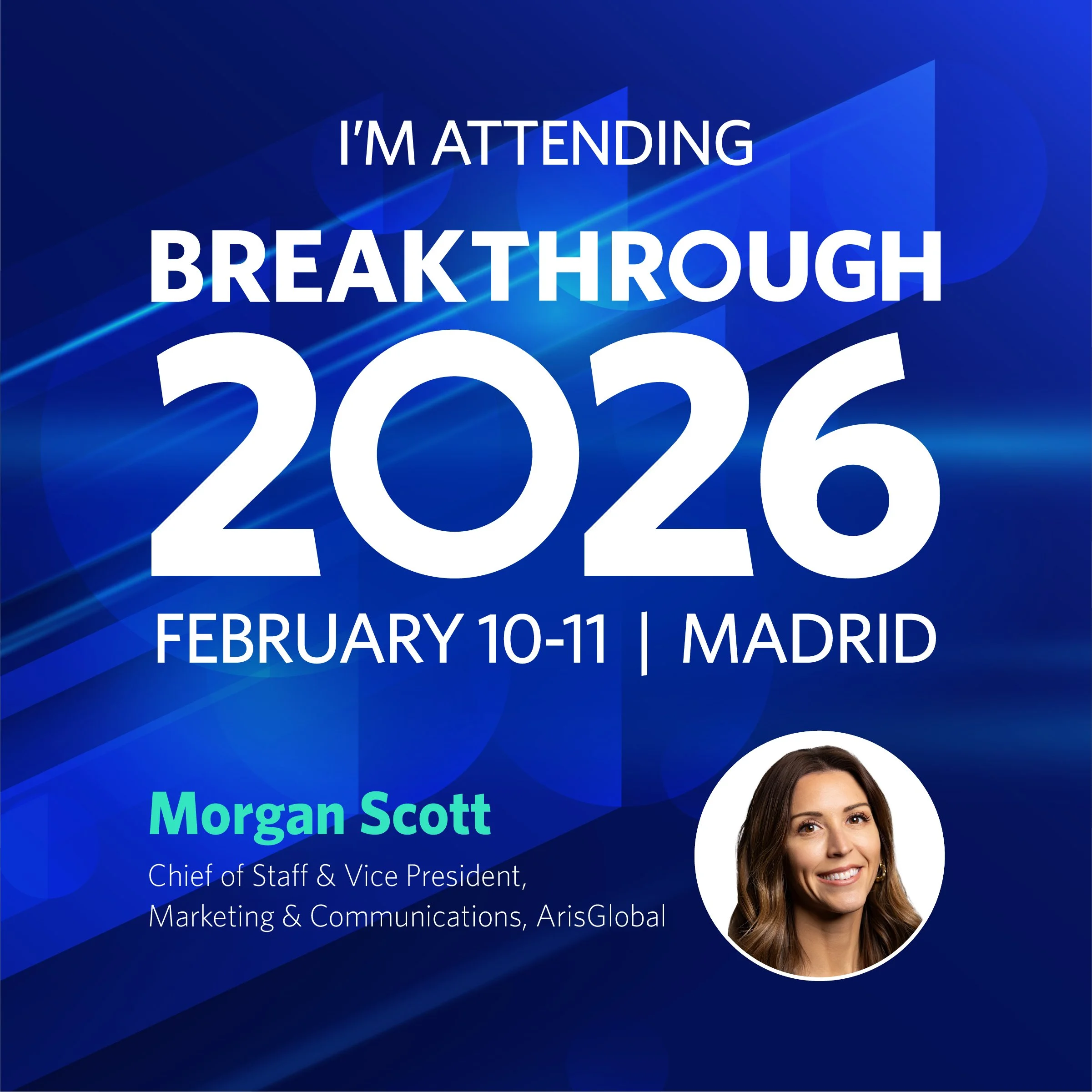
Socil Graphic - Attending
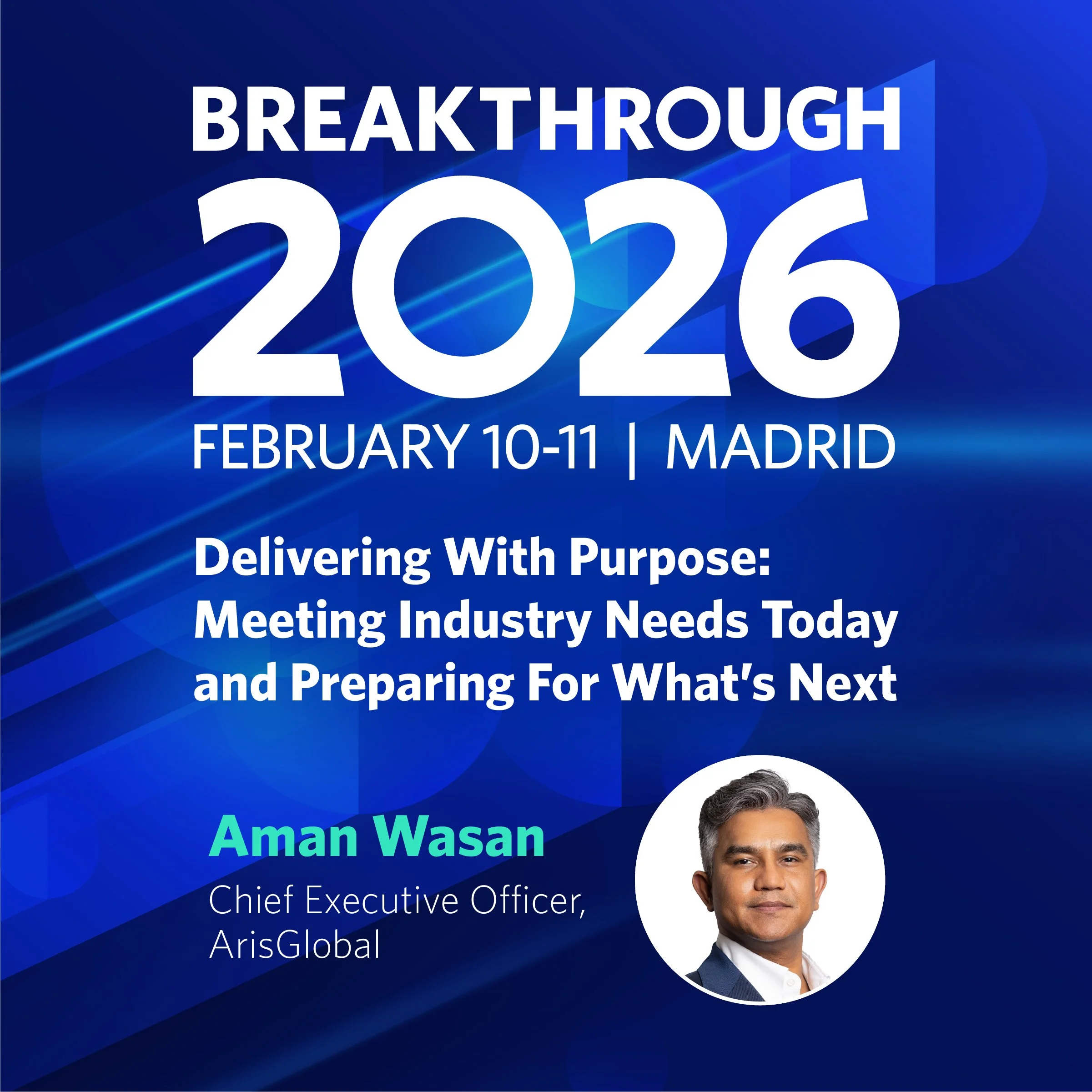
Social Graphic - Speaking
Email Footer/Header
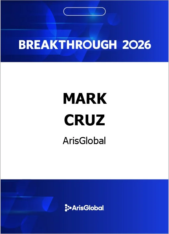
Badge worn with lanyards
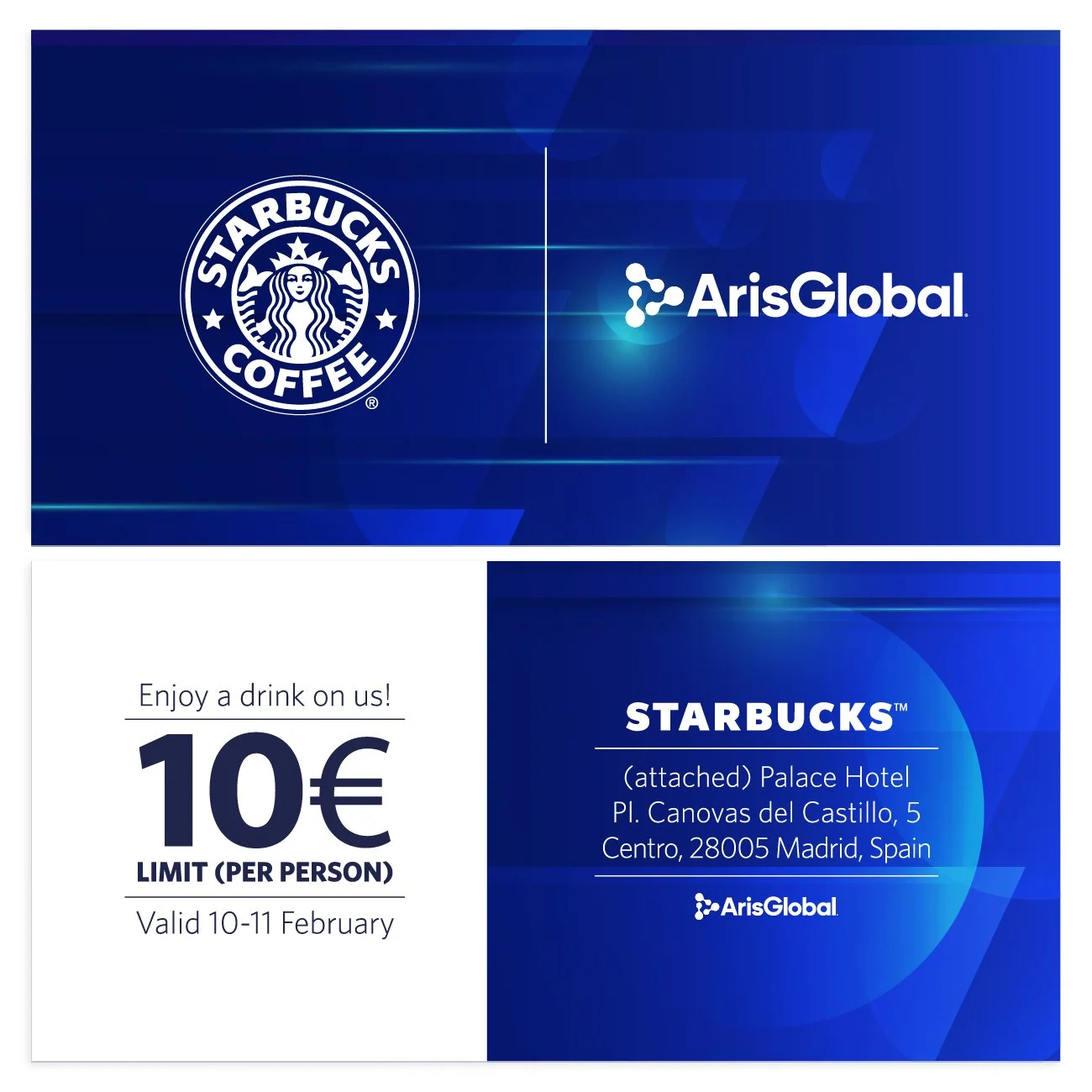
Starbucks Voucher given to attendees